A review sign can sit beside the payment terminal all day and still go unnoticed.
Usually, the problem isn’t the technology. It’s that the customer can’t tell what the sign is for, where to tap, or whether they should scan the code. A crowded layout, small QR code or hard-to-read instruction adds friction at the moment they’re deciding whether to act.
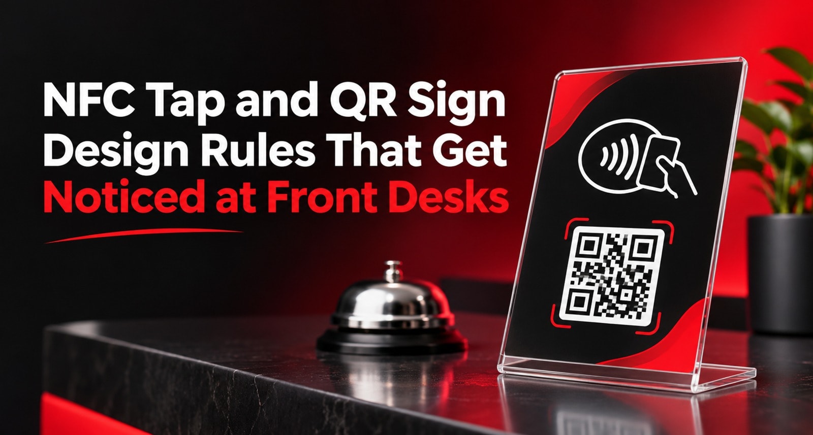
Good NFC and QR code sign design makes the next step clear at a glance. The customer sees what the sign is for, understands how to use it and can reach it without interrupting checkout.
This guide covers practical design rules for review signs at reception desks, billing counters and service areas. The goal is to make the sign easy to notice and use while keeping the invitation to review voluntary.
What Should an NFC and QR Sign Do?
A customer-facing review sign has three jobs:
Catch attention without competing with everything else on the counter.
Explain the action with a short, clear instruction.
Make it easy to continue through a visible QR code, an identifiable NFC tap area or both.
The sign is a shortcut to a review experience. It doesn’t create the customer’s opinion or guarantee a review. A clear sign can remove confusion, but the customer still chooses whether to share feedback.
ReviewTAG describes its hardware as a physical NFC and QR tag connected to a review flow, with branded formats such as acrylic stands and desk pucks. See ReviewTAG’s overview of its review system for more on how the physical tag and platform work together.
Rule 1: Lead with One Clear Message
A sign has very little time to communicate. Customers may be paying, waiting for a receipt or talking with staff. Give them one main idea, such as:
Share your experience
Review us on Google
Tap or scan to leave a review
Avoid making the headline compete with several equal-sized messages, long explanations or a list of benefits. If the sign also includes a logo, support contact or social links, those should remain secondary to the customer’s next step.
A useful layout puts the main message at the top, the tap and scan options in the middle, and any supporting brand details at the bottom.
Rule 2: Make “Tap” and “Scan” Easy to Tell Apart
NFC and QR are two different actions. Show customers what to do for each one.
Use a visible tap symbol or a short instruction beside the NFC area. Place the QR code beside the word “Scan,” with enough space that the code is easy to recognise and point a camera at.
For example:
Tap your phone here
or
Scan the QR code
Don’t assume every customer knows how NFC works or where the chip is embedded. A simple label helps first-time users find the interaction area. A QR option also gives customers another route if they prefer scanning or their phone’s NFC feature isn’t available.
For help thinking through code destinations and placements, see QR Code Management: One Code Per Table, Counter or Campaign.
Rule 3: Keep the QR Code Prominent and Scannable
A QR code needs enough space and contrast for a phone camera to read it. It should be large enough for the expected viewing distance and free from decoration that interferes with the code.
Keep these basics in mind:
Use strong contrast between the code and its background.
Leave clear space around the code.
Keep it flat, sharp and unobstructed.
Don’t place text or a logo over the code unless the QR design has been properly tested.
Avoid surfaces that create glare under desk or window lighting.
The right size depends on where the sign will sit. A small code may work on a desk sign customers hold close to their phones, but the same size may be awkward on a stand customers view from across a deep counter. Test it in the actual location before printing or approving a large run.
Rule 4: Show the NFC Tap Point Clearly
The tap area should be easy to spot and reachable from the customer’s side of the desk. Use a clear symbol or label such as “Tap here.” If the chip is embedded beneath the sign face, the instruction should point to the approximate area that reads.
NFC is a close-range interaction, so placement matters. A sign behind glass or out of reach may still show a QR code but make tapping difficult. Keep the sign where a customer can bring their phone close without reaching across staff equipment or handing over their phone.
If your product includes both NFC and QR, test both on the finished sign. Don’t rely only on the design file or a test on a different sample.
Rule 5: Use Readable Type at Counter Distance
Customers should be able to read the main instruction without leaning awkwardly or picking up the sign. Use a clear typeface, a strong size hierarchy and enough contrast between text and background.
A simple hierarchy might look like this:
Element | What the customer should notice |
Main message | The purpose of the sign |
Action instruction | Whether to tap, scan or choose either |
Tap and QR areas | Where to interact |
Logo or brand details | Which business the sign belongs to |
Keep supporting text short. A paragraph about the business, a long explanation of NFC or several lines of fine print can make the important instruction harder to find.
Rule 6: Use Brand Colours Without Losing Contrast
A review sign should look like it belongs at your front desk. Use your logo, familiar colours and a tone that fits your business. Then check that the text, QR code and tap instruction remain clear against the background.
Branding should support recognition, not make the sign harder to use. If a pale colour reduces QR contrast, reserve it for accents and keep the code on a plain, high-contrast area. If a decorative background makes the tap icon disappear, give the icon its own space.
Before approving the design, view it under the lighting where it will be used. Colours and reflections can look different on screen than they do on a glossy counter.
Rule 7: Design for the Front Desk, Not Just the Mockup
A design can look polished on a screen and still disappear on a crowded counter. Consider what customers see from the place where they stand, sit or wait.
Check the sign against its actual surroundings:
Is it visible beside the payment terminal?
Can a customer reach the NFC area?
Is the QR code facing the customer?
Does nearby signage compete for attention?
Is there enough light to scan the code?
Does the sign remain stable when the counter is busy?
A standee can suit a deep counter or reception desk where customers need to see the message from a short distance. A flatter format may work better where people lean over the counter. The placement should determine the format and size.
For a setup walkthrough, link readers to [ReviewTAG NFC Standee Unboxing and 5-Minute Setup Guide](/blog/reviewtag-nfc-standee-unboxing-setup-guide) once that article is published. For product options, see the ReviewTAG hardware collection.
Rule 8: Keep the Sign Focused
Front desks already collect visual clutter: payment devices, brochures, appointment cards, promotional displays and staff notices. A review sign shouldn’t try to do everything.
Avoid adding unrelated offers, social media prompts, website addresses and multiple calls to action to the same face. If customers have to decide between several options, the review action becomes less clear.
If you need a sign for several purposes, consider whether each purpose belongs at a different customer moment. A payment prompt and a review invitation may be better as separate displays if they compete for attention.
Rule 9: Make the Invitation Respectful
Design should make the action easy to understand, not make customers feel pressured. Use neutral language such as “Share your experience” or “Leave a review if you’d like.”
Avoid language that implies a customer must leave a review, asks only for positive feedback or offers a reward for a favourable rating. A good review request leaves the choice with the customer.
Staff can introduce the sign with a short, natural line:
“Thanks for visiting. If you’d like to share your experience, you can tap or scan here.”
That is enough. The sign and staff prompt should support the customer’s choice rather than push for a particular rating.
Rule 10: Test the Finished Sign Before It Goes Live
Test the physical sign after printing and setup, not only the digital design.
Use a phone to scan the QR code from the position where a customer would stand. Then test the NFC area by bringing a compatible phone close to the marked point. Confirm both open the intended destination and that the page works as expected.
A quick test should check:
The QR code scans in the actual lighting.
The NFC point is easy to locate.
The sign is stable and visible.
Both routes lead to the correct review flow.
Staff know how to explain the options.
The sign remains reachable when the counter is in use.
If a sign’s destination can be managed through a dashboard, review the destination when your business information changes. Don’t assume a link is correct simply because it worked during the original setup.
Design Checklist for an NFC Review Sign
Before approving the design, ask:
Is the main message clear at a glance?
Can customers tell where to tap and where to scan?
Is the QR code large enough for its placement?
Is the type readable from the customer’s side?
Do the colours provide enough contrast?
Can customers reach the tap area?
Is the sign free from competing messages?
Does the wording leave the review decision to the customer?
Have both tap and scan been tested on the finished item?
If the answer to any question is no, revise the layout or placement and test again.
Common NFC and QR Sign Design Mistakes
A QR code without an instruction. Some customers may recognise it immediately, but adding “Scan to review” removes guesswork.
A tap symbol with no clear location. If the chip is embedded, point customers to the area where their phone should touch or hover.
A sign designed only for close viewing. Customers may not see small instructions from where they queue. Test at the actual distance.
Too many messages on one face. Extra promotions and contact details can drown out the review action.
Decorative QR codes that don’t scan reliably. Design treatments should never make the code harder to read. Test the final print.
A sign that staff can’t reach or customers can’t approach. Physical placement is part of the design. Keep the stand accessible from the customer side.
Prompts that feel demanding. A clear invitation works better as customer guidance than as pressure.
Should You Use a Standee, Card or QR Sign?
Choose the format around the customer interaction.
Format | Often useful when… |
NFC and QR standee | Customers pause at a counter or reception desk |
NFC review card | Staff hand a card to a customer during checkout or service completion |
Printed QR sign | Customers need a visible scan option at a window, table or counter |
Desk puck or compact display | The sign needs to sit within reach on a table or small desk |
A business may use more than one format if customers have different pause points. For a single front desk, begin with one well-designed sign, observe whether customers and staff use it, and adjust placement before adding more.
For a stand and card comparison, see Google Review Stand & NFC Card Combo: Why Pairing Hardware Works Better. For pricing context, see What a Google Review Stand Should Really Cost in India in 2026.
Get a Professionally Designed ReviewTAG NFC and QR Standee
An effective front-desk sign gives customers a clear message, an easy-to-find tap point and a QR code they can scan without fuss. Keep the layout focused, test it in place and let customers decide whether they want to leave feedback.
Get a professionally designed ReviewTAG NFC and QR standee for your business. Explore the ReviewTAG hardware collection, create a business account, or talk with the team on WhatsApp.
FAQs
What should an NFC and QR review sign say?
Use a short message that explains the action, such as “Tap or scan to share your experience.” Keep the wording neutral and make the tap and scan areas easy to identify.
How large should a Google review QR code stand be?
It depends on how far away customers will be when they scan. Make the code large enough for the real counter distance, leave clear space around it and test the final printed sign in its intended location.
Should an NFC review sign also have a QR code?
Offering both gives customers a choice. Some may prefer tapping, while others are more comfortable scanning a QR code or may not have NFC available.
Where should I place review signage at a front desk?
Place it in the customer’s line of sight and within reach, near a natural pause such as checkout or reception. Keep the code facing the customer and away from glare or obstructions.
Can a review sign guarantee more reviews?
No. A sign can make the path clearer, but it can’t guarantee that a customer will leave feedback. Placement, a good customer experience and a respectful invitation all matter.
About the author

Chandu Venkata Satish
Digital Marketing Consultant & Strategist
Chandu is a Digital Marketing Consultant and Strategist focused on brand growth, Digital positioning, and High-impact marketing solutions. He specializes in transforming ideas into scalable digital success through strategy, innovation, and performance-driven execution.
LinkedIn